Pan | Painted Series | The Diamond Smugglers 2nd (G328)
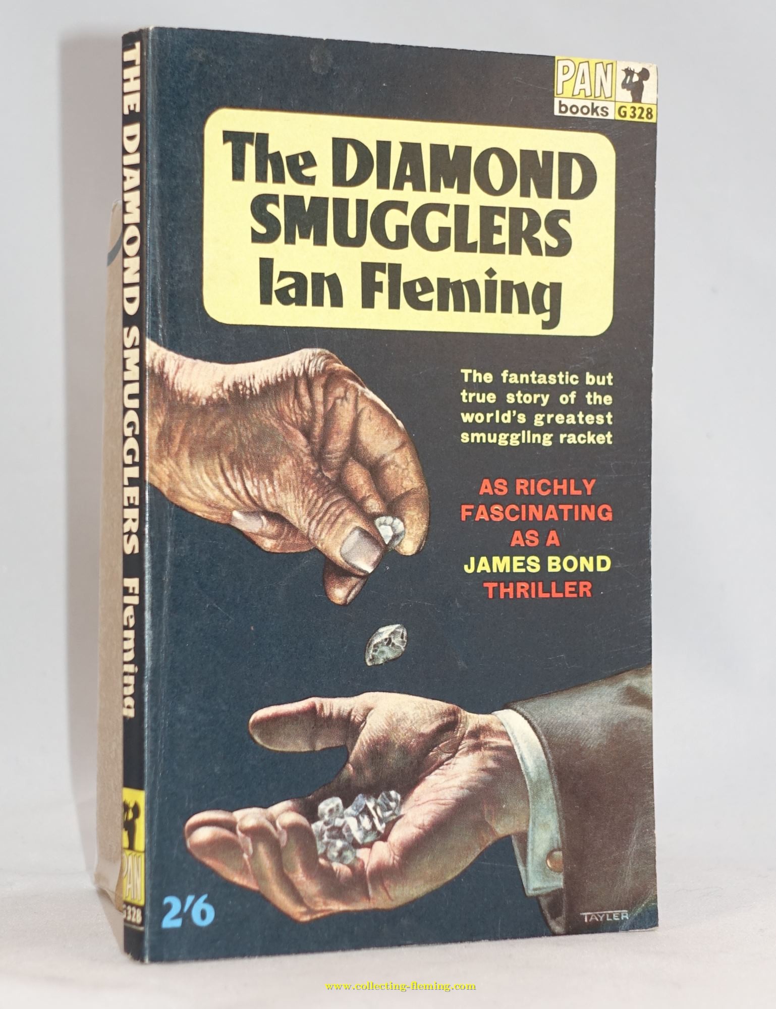
This artwork by David Tayler was only used for the 2nd through 7th ediitons (G328)
15. The Diamond Smugglers
Author : Ian FlemingPublisher : Pan / Great Pan
Format : Paperback
Series :
Edition : 2nd through 7th
Year : 1963 (first published with this artwork)
Country published : UK
Artwork designer : David Tayler
General Notes
Looking back over 50 years later the 1st edition artwork looks far more interesting that that used for the 2nd through 7th, perhaps this explains slow sales for the later editions. David Tayler designed both covers, perhaps it was a mistake to ask the same artist to redesign his own work?Editions and pricing variants found with this artwork
The following editions / pricing variants have been found in our collections: 2nd printing 1963 with G328 to spine- Copies found with 2’6 printed to front cover
- One copy found with 2’6 label to front cover
- Copies found with 2’6 printed to front cover
- Copies found unpriced (export copies)
- Copies found with 2’6 label to front (excess export copies sold in UK)
- Copies found with 2’6 printed to front cover
- Copies found with no price to front, 4'- Australia, 60c Canada printed to rear
- Copies found with 2’6 printed to front cover
- Copies found with 2’6 printed to front cover. 4’- Australia and 60c Canada printed to back`
- Copies found with unpriced on front cover. 4’- Australia and 60c Canada printed to back
- Copies found with 60c printed to front cover. 4’- Australia and 60c Canada printed to back
- Copies found unpriced on front cover. 4’- Australia and 60c Canada printed to back
Collectors notes
The 1st edition is not easy to find in good condition. The 1st, 3rd, 4th and 7th printings have thicker paper, the books are about 18mm. The 2nd, 5th and 6th printings have thinner paper and the books are around 11mm thick. Unlike the thick paper versions of Live and Let Die the thick paper is not of a higher quality and darkens / foxes in a similar way to the thinner paper. The 2nd through 7th printing have the later Pan logo but are not part of the “X series”. There are other differences between these cover artworks and the other “Painted” books in the series - look for example at the font used for “Ian Fleming” on the cover