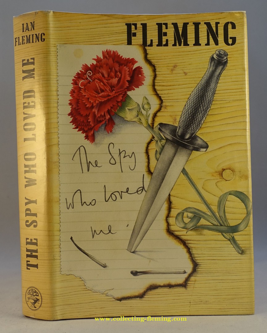
Jonathan Cape | The Spy Who Loved Me 1st edition
The same dust jacket artwork was used on all editions

Most copies have the dagger to the front
Some copies of the 8th edition, 1980 lack the dagger
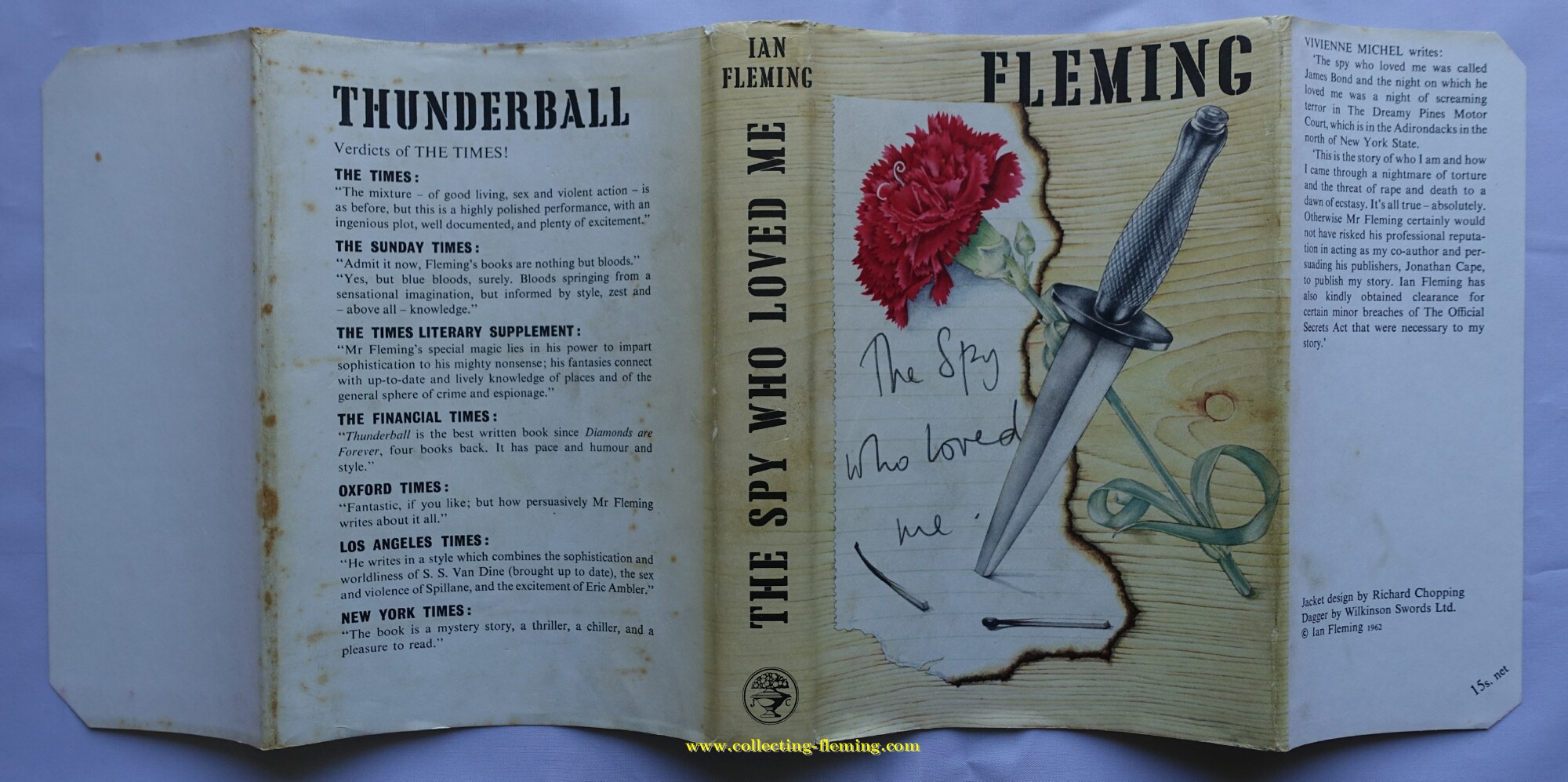
1st edition dust jacket

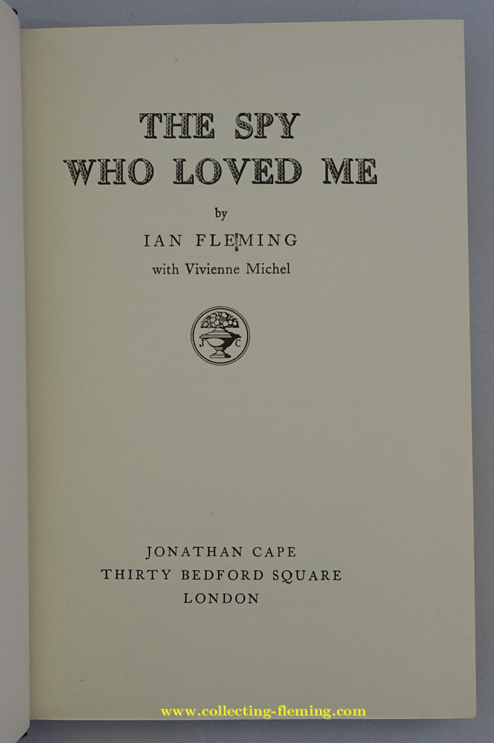
1st edition copyright page
Quad mark variant - see notes
10. The Spy Who Loved Me
Author : Ian FlemingPublisher : Jonathan Cape
Format : Hardback
Series : Cape hardbacks
Edition : 1st
Year : 1962 (first published with this artwork)
Country published : UK
Artwork designer : Richard Chopping
Editions and pricing variants found with this artwork
The last photo shows the “quad mark variant”. On a few copies there is a printing error between the E and M of FLEMING. Such copies carry a price premium. Some copies of the 8th edition (1980) lack the dagger to the front cover. The same artwork was also used for the US edition of this book, the most obvious difference is that at the bottom of the spine the publishers name Viking replaces the Cape logo. An interesting letter from Fleming to Richard Chopping concerning the design of the dust jacket can be found on the Letters Of Note web site.Collectors notes
As with the other Chopping designed “woodgrain” jackets sunning / darkening of the spine can be a problem. The white rear panel can be marked or foxed.