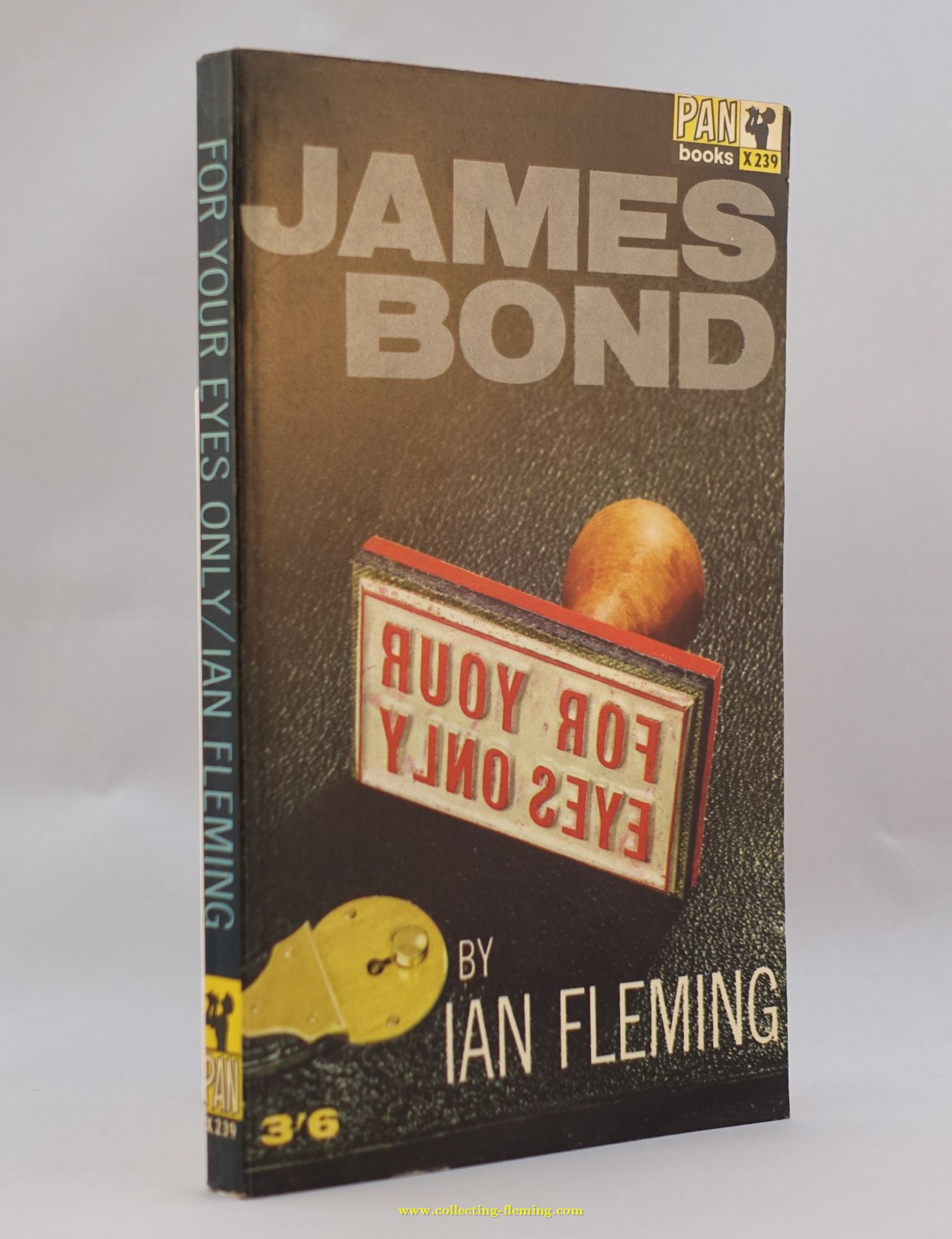
For Your Eyes Only | Pan | Hawkey | X239
The same dust jacket artwork was used for the 6th to 16th printings
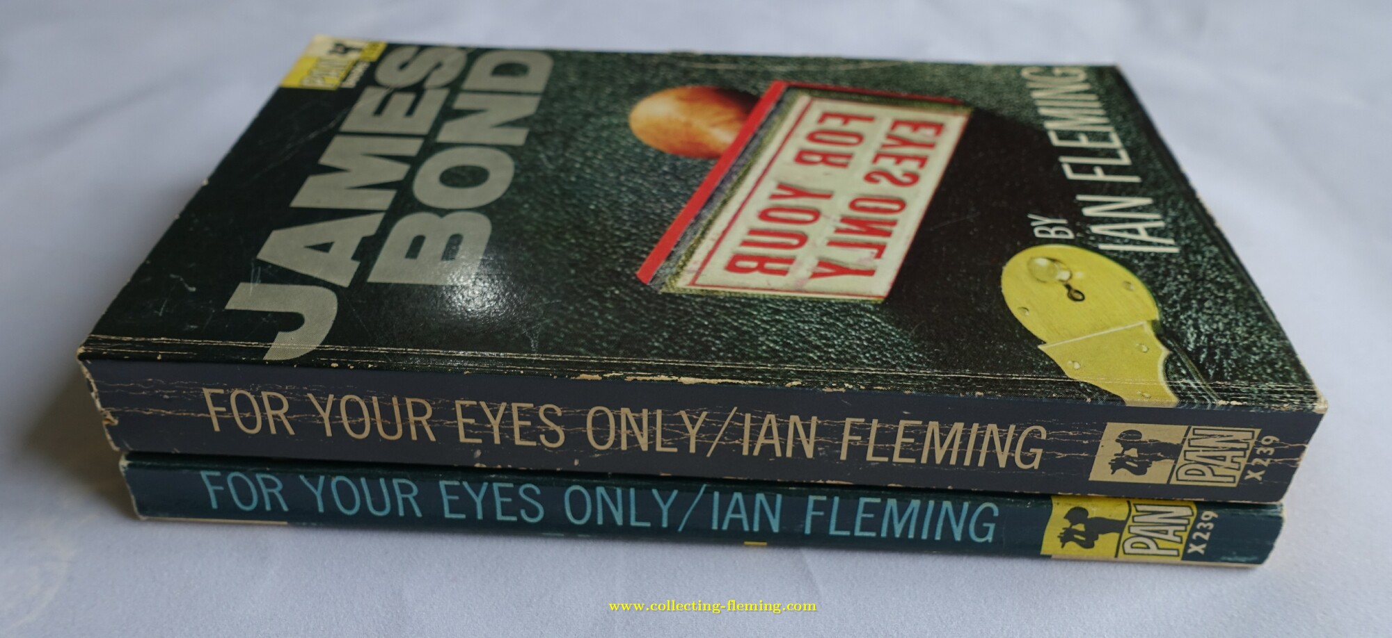
There are 2 variants of the 16th printing (thick and thin) see text for more details
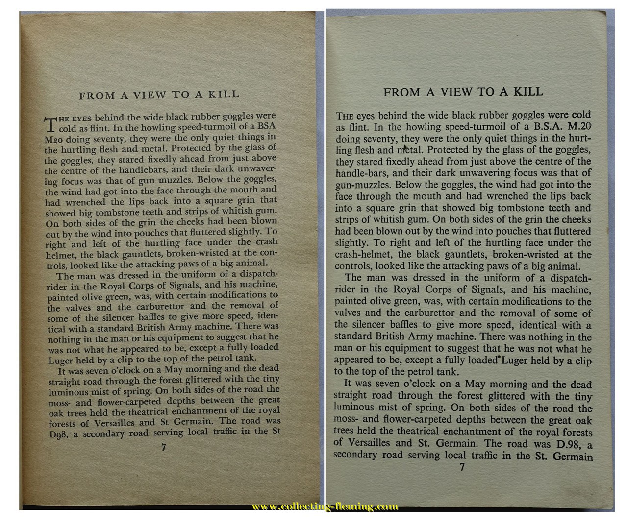
The right hand page is from the "thick" version which seems to be a unique layout not used elsewhere
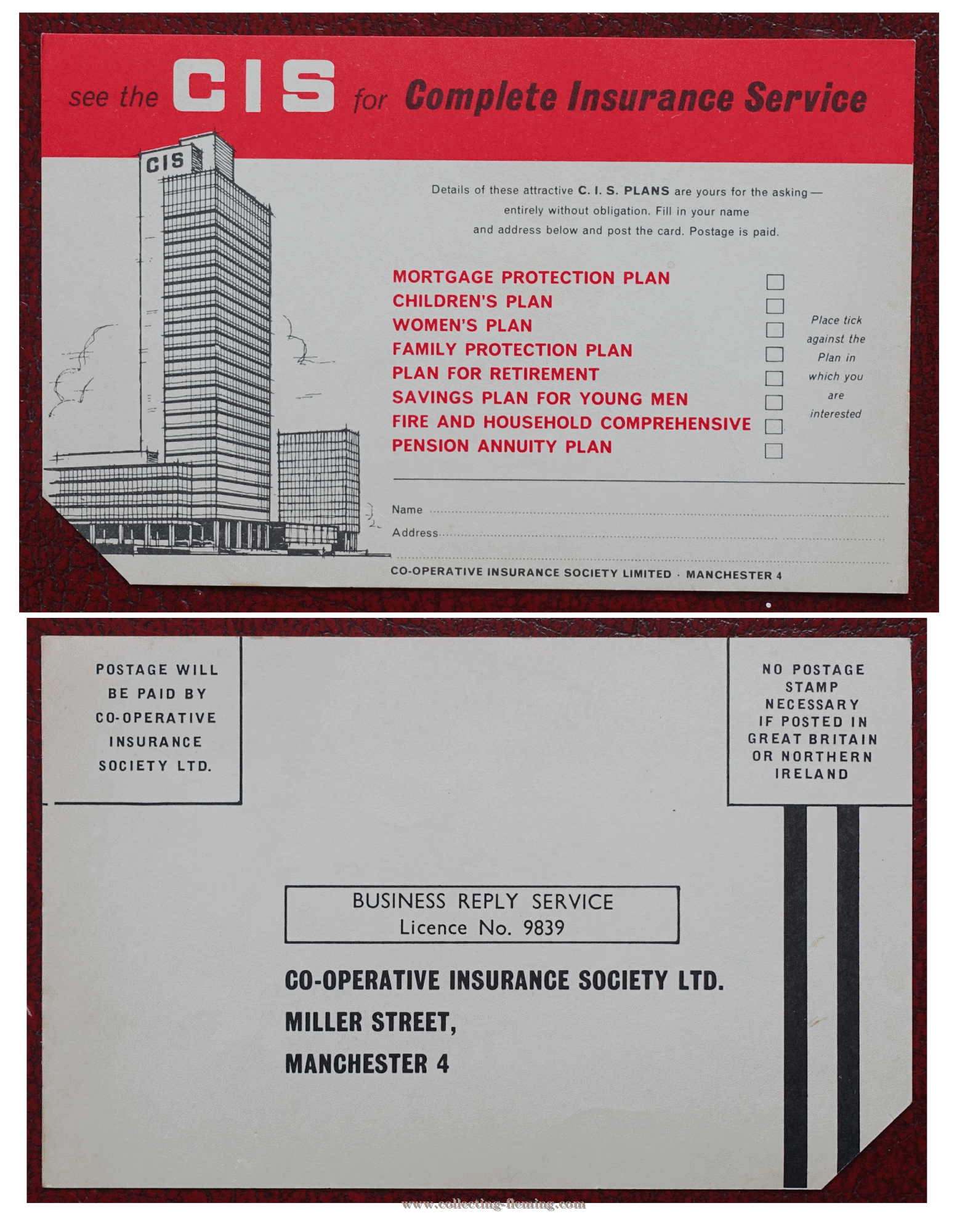
CIS insurance advertising postcard found inside a 15th printing 1965
08. For Your Eyes Only
Author : Ian FlemingPublisher : Pan / Great Pan
Format : Paperback
Series : Pan Hawkey series
Edition : 6th to 16th
Year : 1963 (first published with this artwork)
Country published : UK
Artwork designer : Raymond Hawkey
General Notes
In 1963 graphic designer (and novelist) Raymond Hawkey created a fresh new look for the Bond novels. The uniform design with minimal graphics contrasted with the “painted” designs of the previous series. The consistent use of modern fonts helped the series have a uniform look as did having “JAMES BOND” in large bold text at the top of each book. Elements of this design can be found in the Pan “Model” series of the 1970s and in the Panther / Triad series of the 1980s. Millions of copies of the Bond paperbacks were printed in the “Hawkey” series and for many is the definitive paperback series, indeed for many people of a “certain age” it was their introduction to reading James Bond novels. Thunderball is the only book in the series where Hawkey is credited (Cover design by Raymond Hawkey) so it is possible Pan staff laid out some of the other designs. The majority of the books were released with Hawkey designs in 1963 but the timing of the film releases of Dr No and From Russia With Love means that the “Movie Tie In” editions were published first. This pushed the release of the Hawkey cover versions of these titles out to 1964/65 and means they are less common than the others. It is probable however that these covers were designed at the same time as the others as early / prototype editions have been found.Editions and pricing variants found with this artwork
The following printings with this artwork have been found in our collections. Note all printings have X239 to the spine. 5th printing 1963. A single copy has been found (with 3’6 printed to the front cover). This is likely to be a pre-release / test printing. 6th printing 1963. Copies found with- 3’6 printed IN GREEN to the front cover.
- Unpriced (found in Australia)
- 3’6 printed to the front cover.
- 5'6 printed to front cover (Australian printing)
- 3’6 printed to the front cover
- Unpriced (found in Australia)
- 3/6 sticker on front cover (If you have a copy you are willing to sell or trade please get in touch)
- 60c printed on front cover (If you have a copy you are willing to sell or trade please get in touch)
- 3’6 printed to the front cover.
- Unpriced
- 3’6 label to front cover
- 3’6 printed to the front cover.
- Unpriced
- 3’6 label to front cover
- 3’6 printed to the front cover.
- 60c printed to the cover (Canadian pricing)
- 60c sticker to the front covering 3’6 printed (Canadian re-pricing)
- Unpriced
- 3’6 printed to the front cover.
- Unpriced.
- 3’6 printed to the front cover.
- 60c printed to the cover (Canadian pricing)
- Normal width with 3’6 sticker to front, no pricing to back
- Normal width with no pricing to front, pricing printed on the back in red: United Kingdom 3’6, Australia (6’-) 60c, New Zealand 4/6, South Africa 45c
- Thick version with no pricing to front, pricing printed on the back in red: United Kingdom 3’6, Australia (6’-) 60c, New Zealand 4/6, South Africa 45c
Collectors notes
As all 14 bond books were published in this uniform series, copies are plentiful so they make an ideal first set of books for the new collector. From Thunderball onwards the 1st Pan printings were in this Hawkey series, surprisingly On Her Majesty’s Secret Service 1st Pan edition is perhaps the most difficult to find / most valuable of all the Pan paperbacks (especially without any price to the front). The main reason for this is that the 1st four printings were export only.